Category Archives: 2D Design

Composition

Learning Objectives

Students will be able to define the Elements and Principles of Design.

Students will be able to demonstrate a basic understanding of the Elements and Principles of Design

Materials

  • Any materials that you may have in your home or dorm. Try to find a variety of materials but avoid printed or digital images. You could use clothing, paper, carpet, grass, fruits or snacks, pretty much anything.

Sketchbook

Define the Elements and Principles in your sketchbook with both a brief description and a quick sketch. You can find more information about the Elements and Principles here or the Elements and Principles link to the right under Research.

Take notes on the videos Elements and Principles page in your sketchbook.

Project

Part 1 – For part 1 of this project I want you to use your phone to create 5 different compositions. For each of the 5 composition choose one element and one principle to illustrate using objects that you have around you. For example, you might pair the element line with the principle balance. You could arrange spaghetti in a way that illustrates asymmetrical balance. After you have arranged your chosen objects, photograph them with your phone in black and white (or add a black and white filter). Add these images to your Google Slides Presentation for projects and share that presentation in the Projects Discussion on Pipeline. For Part 1 of this assignment we will not be using any color. * For each of these tell me how each image is using the element and principle that you’re focusing on.

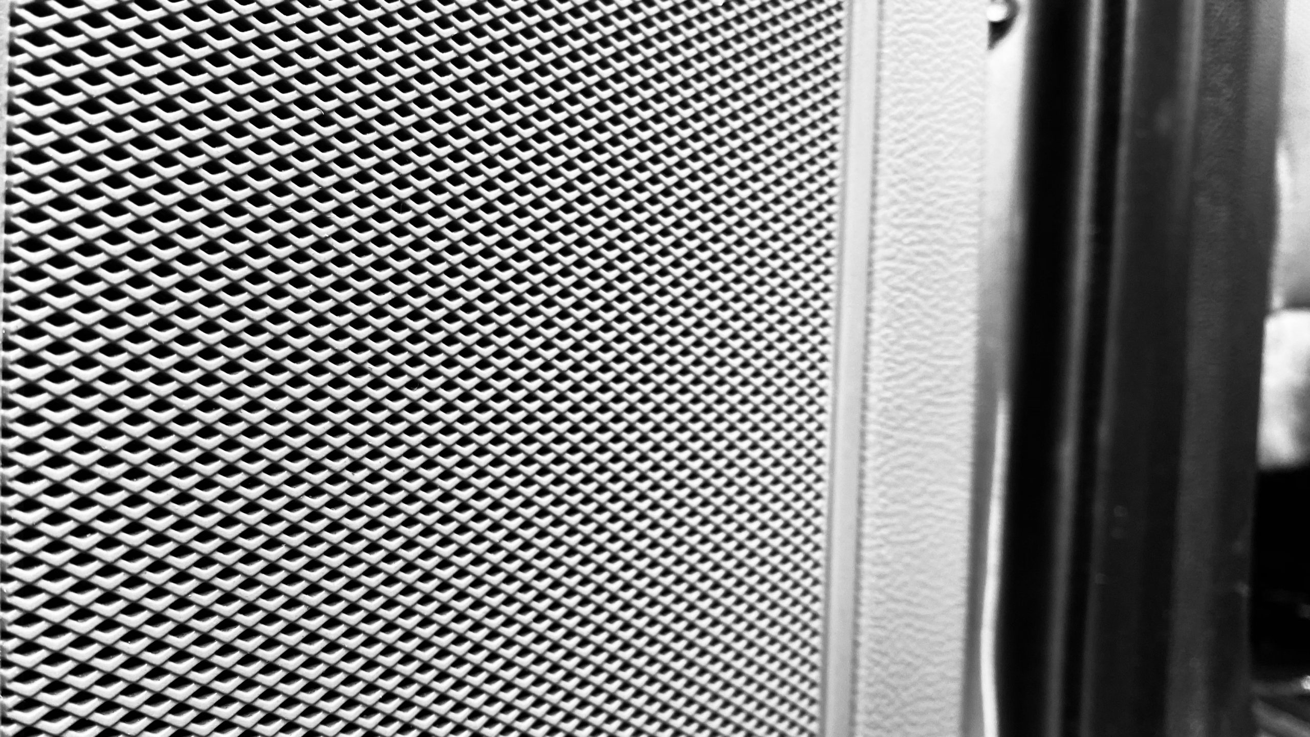
Part 2 – After you have completed AND received feedback on Part 1, I want you to create 3 more. For these 3 I want you to explore the element color and one principle of your choice. For example you might combine color and repetition, color and unity, color and movement, etc. Once you are done arranging your composition, take a photo of each with your phone and upload to D2L. Add these images to the same Google Slides Projects Presentation. For these 3 make sure that you don’t use any filters. * For each of these tell me how each image is using the element and principle that you’re focusing on.

Repetition through Value

Research

Handout – Elements and Principles of Design

Presentation – Elements and Principles of Design

Colored Pencil Designs

Learning Objectives:

  • Students will be able to demonstrate appropriate colored pencil techniques through incredible craftsmanship.
  • Students will be able to design engaging compositions using limited subject matter.
  • Students will demonstrate appropriate color schemes when creating their drawings.

Materials:

  • 2 sheets of Bristol or Illustration Board
  • Prismacolor brand color pencils
  • Pencil for sketching compositions
  • Color photographs AND / OR real objects of each of the following:
    • A Number
    • A String
    • A Strawberry
    • A Target
    • Three objects of your choosing (nothing with text and no electronics)

Sketchbook:

There are multiple parts to this project. In order for us to really understand color theory before we start the main project, there are a few smaller projects I want you to do as part of your sketchbook grade.

Part 1 – Take Notes in Sketchbook from the color theory section found here.

For parts 2 through 5 you will use one sheet of Bristol board divided into 4 equal parts. For the major project you will use one sheet of Bristol board cut in half.

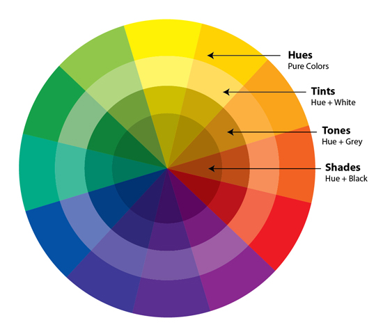
Part 2 – For the second part of the project create a color wheel using your colored pencils. You will need to include primary, secondary and tertiary colors. The color wheel should include the hue, a tint, a shade, and a tone. Use the image below as a reference.

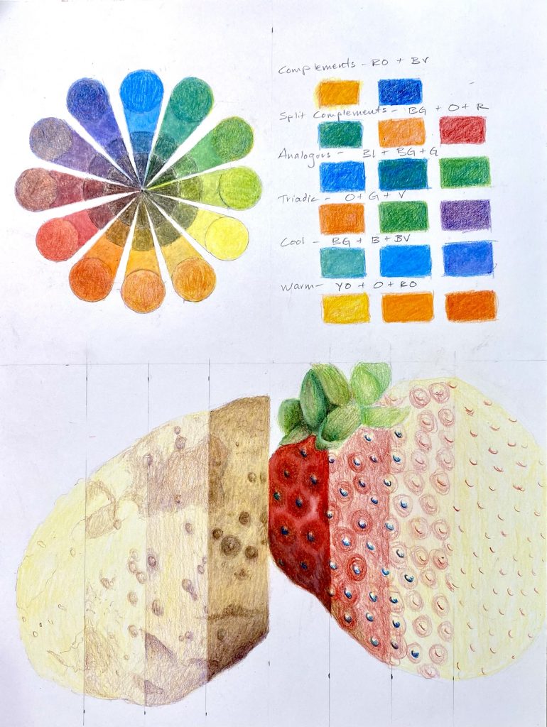
Part 3 – Create an example of each of the following color groupings – complementary, split complementary, analogous, triadic, cool and warm colors. Try to avoid red / green, blue / orange combinations.

Part 4 – Find a stick, rock or potato and bring it in. A lot of times the things that we think are just brown, beige or grey actually have a lot of color. I want you to bring that color out in this illustration. Don’t over emphasize colors that aren’t there but do pay close attention to the ones that are. Even grey sometimes has a hint of blue or red in it.

Part 5 – Using a colorful fruit or vegetable and Prismacolor, create a realistic drawing. Focus not only on proportions and shape but also on color. Is there a local color you can start with (like the red in a strawberry) and then build off of that? Even the red in a strawberry has hits of yellow and green. Try to build your layers slowly until you get the color color and texture.

It should look something like this when you’re done.


Project:

  1. In your sketchbook, work out several compositions using at least 3 of the elements from the list above (string, strawberry, etc). You must include at least 3 but do not need to use all of them. Your colored pencil drawings will be 5″ by 8″ so start with that size as you work out your compositions. Each of your compositions should be different from each other but you do not have to use different objects for each. Make sure I see these compositions before you start the next step.
  2. Using a sheet of 9″ by 12″ Bristol board and a pencil, draw a 5″ by 8″ rectangle in the center. Make sure it is centeredIf done correctly you will have a 2 inch margin on all sides.
  3. Draw the compositions you created in your sketchbook to scale on your sheets of Bristol board. Use a very gentle hand when you’re drawing on your Bristol board. If you press too hard it will leave an indentation on the paper that will show up when you go to use colored pencils.
  4. Before you start using the colored pencils, work out color combinations in your sketchbook. Make sure you know the color scheme or theory your are going to work with before you start drawing. I will ask “What color scheme are you basing your drawing off of?” Be prepared to know. You do not need to stick to the actual colors of the object but be careful of using intense contrasting colors.

A hint – Colored pencils can be built up using thin layers to gradually create nice gradations, texture and shadows or applied more heavily for rich, intense colors. If the layer of wax from the colored pencil gets too thick, too quick it may be difficult to lighten it or erase it. Work slowly. Craftsmanship is of utmost importance. No pencil marks should show unless they are an integral part of the composition. One last note. Take care of your work. Fingerprints, smudges and creases will all affect your craftsmanship score.


Research:

Light and Color (Google Slides Presentation)

CJ Hendry on Instagram

Collage

Learning Objectives

Students will learn the basics of good composition through the exploration of the elements and principles of art.  Using the technique of collage, students will be able to assemble various shapes, colors, textures and lines to create engaging works of art.

Mini-Assignment

1. In your sketchbook, list and define the 7 Elements and the 8 Principles of Art. It may help to draw pictures that accompany each.
2. Draw 10, 5″ by 7″ boxes in your sketchbook.  Using a drawing pencil and colored pencils, work out several very different compositions in each of these boxes.  Your goal is to have several good compositions to work with once you start your collages.
3. Take notes on Dieter Rams design principles found in the video below

Materials

Glue Stick
Xacto Knife
Ruler
Magazines
Bristol or Illustration Board

Time

3 Classes

Process

For this assignment you will be focusing on creating good design, also known as composition. Composition is the arrangement of the Elements and Principles of Art. Good composition, or good design, is as important if not more important than technical skill.

You will create 3, 5″ by 7″ collage compositions on bristol board using fashion magazines, glue sticks (Elmer’s kind), and an xacto knife and/or scissors. These designs should stress subject over content. This means don’t weigh your compositions down with content (the blue bird represents my flight into freedom…). Just focus on design elements. You should not have recognizable subject matter. As soon as you introduce a person, animal, or anything we identify with into the composition, it becomes less about the design and more about the object we already know.

This idea of composition and the formal elements of art comes from the very beginnings of abstract art. These artists were not interested in subject matter per se, but rather how this line interacts with that line or how this color makes this other color “pop”. Listed below are a few artists you should research.

Artists

Robert Rauschenberg
Wassily Kandinsky

Close Portraits

Learning Objectives

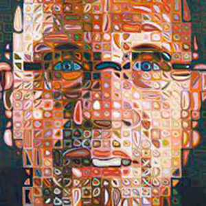
Students will be able to identify Chuck Close and Georges Seurat work and painting process. Students will be able to identify color schemes and will demonstrate basic understanding of color theory. Students will be able to demonstrate techniques used for optical color mixing through acrylic paint. Students will also demonstrate the process of using a grid to scale up an image.

Materials

11 x 14 Bristol or Illustration Board
Pencil
Self-Portrait Photograph
Ruler
Acrylic paint (at least the primaries and white)
Paintbrushes (small)
Small cups for water
Plastic Palette or lid top (white)

Time

4 Classes

Homework

Work on painting outside of class.

Process

Using the photo taken in class, draw a box (crop) your image to 5.5 x 7 inches. This is 1/4 the size of your finished painting. Using a ruler and a pencil, draw a 1/4” grid on top of your photograph. This should give you 22 boxes horizontally and 28 boxes vertically for a total of 616 boxes. You do not need to count them.

On your 11 x 14 sheet of Bristol or illustration board, draw a 1/2 inch grid. This will also give you 22 boxes horizontally and 28 boxes vertically. Now that we have exactly the same number of boxes on your photo and the same number on the illustration board, we can easily scale the 5.5 x 7 image up to 11 x 14. To make things easier, write A, B, C… horizontally across the top line of boxes and 1, 2, 3… vertically along the left side of boxes. Do this on both the photo and sheet of illustration board. This allows you to easily transfer what is in box B1 on your photo into B1 on your drawing/painting.

Now that you have your grid drawn out, start drawing your portrait. Transfer what is in the boxes in your photograph to your illustration board. This should be a very basic drawing as the details will be addressed when you start painting. On a separate sheet of paper and/or using some of the links to the right, decide on a color scheme. You may approach this project several different ways, either trying to paint the colors in your photo as they look or creating an entirely new color scheme.

The goal of the project is to create an engaging image in terms of color, composition and technical skill. You should see the blocks in your final painting so be careful not to paint over the lines. If you need to cut a block in 1/2 or into a 1/4 you can.

Resources

Chuck Close Wikipedia
Chuck Close Process and Collaboration
Georges Seurat Wikipedia
Chuck Close Interview MoMA, Part 1
Chuck Close Interview MoMA, Part 2

10,000 Lines

Learning Objectives

1. Demonstrate an understanding of the visual element line and texture and the visual principle pattern / movement.
2. Demonstrate an understanding of detail and craftsmanship

Mini-Assignment

1. Create 5 small drawings in your sketchbook of 5 different, small sticks.  Focus on their complexity and the tiny nuance that makes them unique.
2. Read and watch videos on Line, Texture, Form and Value on the Elements and Principles link to the right (or click here). Take notes in your sketchbook.

Major-Assignment

1 creation using 10,000 lines

Materials

To be determined by the artist

Info

One of the toughest parts of starting off as an artists is being able to let go of preconceived notions of what an artist must be and what art must look like. This project will challenge that. Your goal is to create a work of art using 10,000 lines. You are not allowed to ask questions until after the first 1,000. Don’t try to draw some thing. Allow yourself to respond to what you are doing. What parts are interesting? Why? What parts do you want to get rid of? Why? Remember that a ling is nothing more than a mark. Knowing that, be creative.

While 10,000 lines is a lot, don’t be afraid to slow down. Being able to slow down and pay attention to our surroundings is one of the keys to being a successful artist.  Musicians do it.  Poets do it.  Artists do it.  When we slow down we start to notice the patterns shadows create on the pavement.  We notice the freckles on someone’s face. The job of the artist is to create an experience for the viewer, whether that is a beautiful painting of those patterns on pavement or the close up of those freckles.

This assignment will force you to create, react, respond, delete and destroy.

Process

You need 10,000 lines.
You cannot ask any questions until you have 1,000 lines.

Artists / Resources

Julie Mehretu
Sol Lewitt
Richard Long (A line made by walking)